February 26, 2024
In 2022 Bloomberg Media announced a shift to an audience-first strategy, which includes every action and decision the teams make, investing time to understand our customers across every platform we operate— and to focus on building features, products and businesses that truly serve them.
The sixth post of this series explains Bloomberg Media’s redesigned home page.
By Marissa Zanetti-Crume, Global Head of Product
Our vision since launching Bloomberg.com has been to arm business leaders with the news, information and connections they need to succeed. It’s an ongoing journey to get to know our users, understand what they’re interested in and what keeps them coming back — and through the power of our global newsroom, we’ve been successful in implementing that vision for decades. But there’s always more we can, and want, to do to make sure we’re keeping their experience as useful as we can.
We’ve sought to build out a new homepage with our subscribers in mind, first and foremost. We know they use the homepage regularly and we wanted to make it a place where they can easily see the value of their subscription but also where new users can learn what Bloomberg has to offer. So today, we’re introducing an evolved homepage for Bloomberg.com, reimagined for maximum utility.
Now when users visit bloomberg.com and mobile web, what’s important and exclusive is better clearly identified, and new features that leverage market data, personalization and customization can help them navigate our broad areas of coverage.
Here’s what our users will now be able to experience on the homepage starting today:
A new dynamic homepage that quickly and clearly shows readers what’s important, with improved organization and navigation.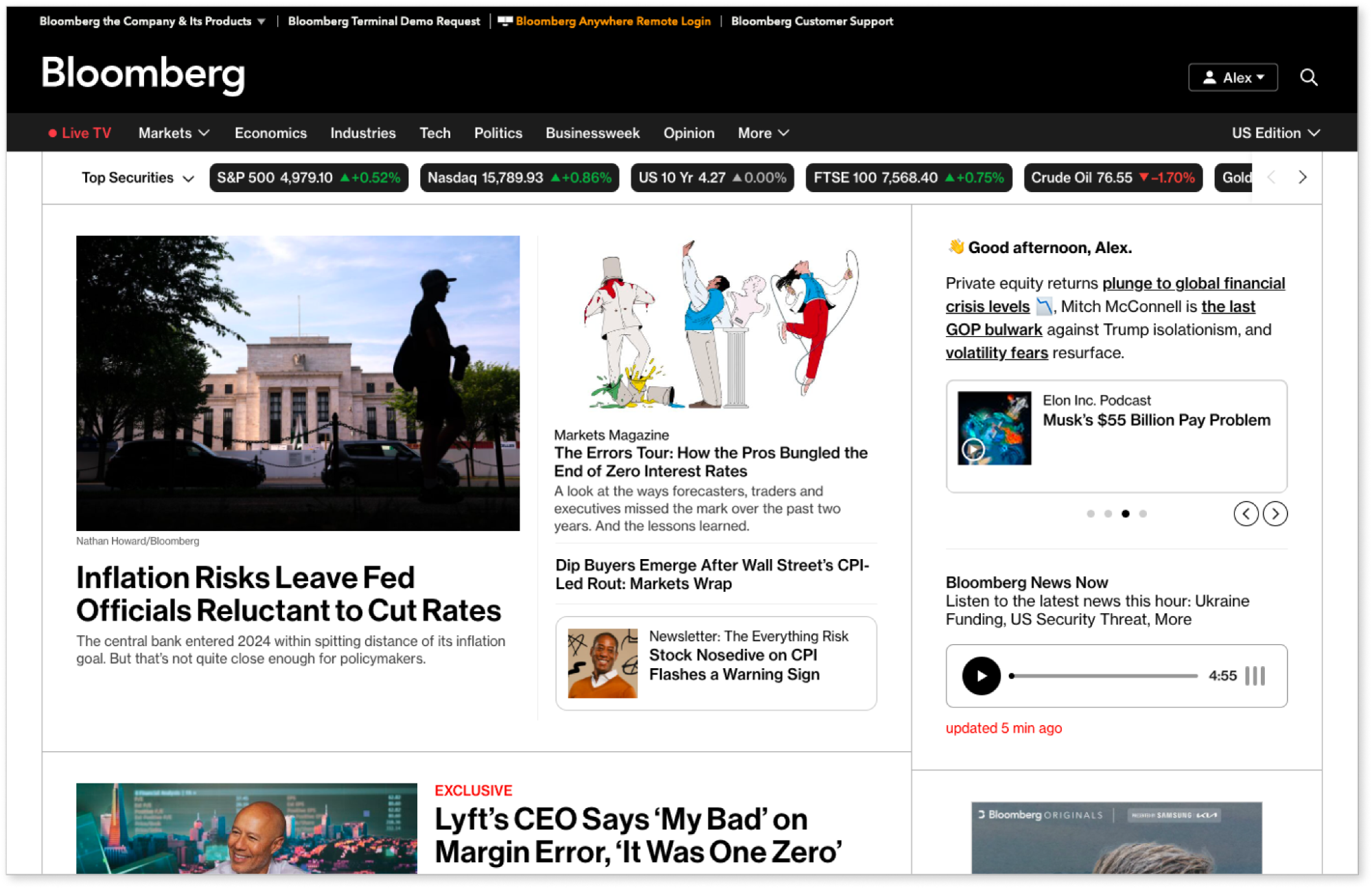
A breaking news banner and video placements that incorporate multimedia when it’s relevant — for example, a live video stream as part of a breaking story.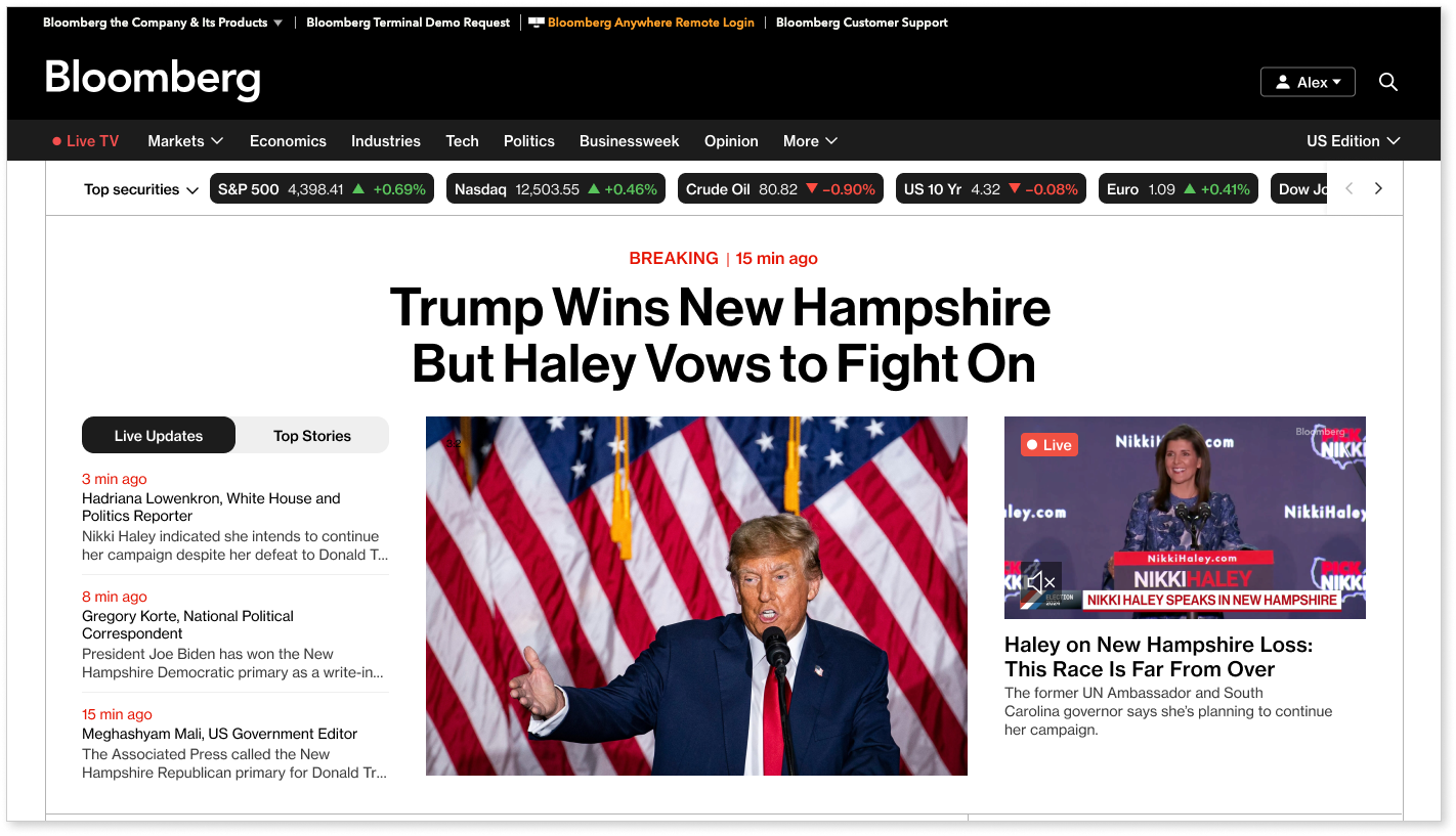
Cross-platform exploration with new modules that introduce users to similar topics to the main story, and in different content types beyond articles — such as a link to a related newsletter, video or podcast.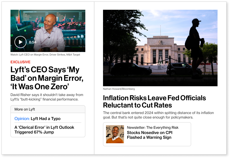
A prominent location for our “Bloomberg News Now” player, where users can listen to a 5 minute summary of the latest news that’s updated frequently by our newsroom.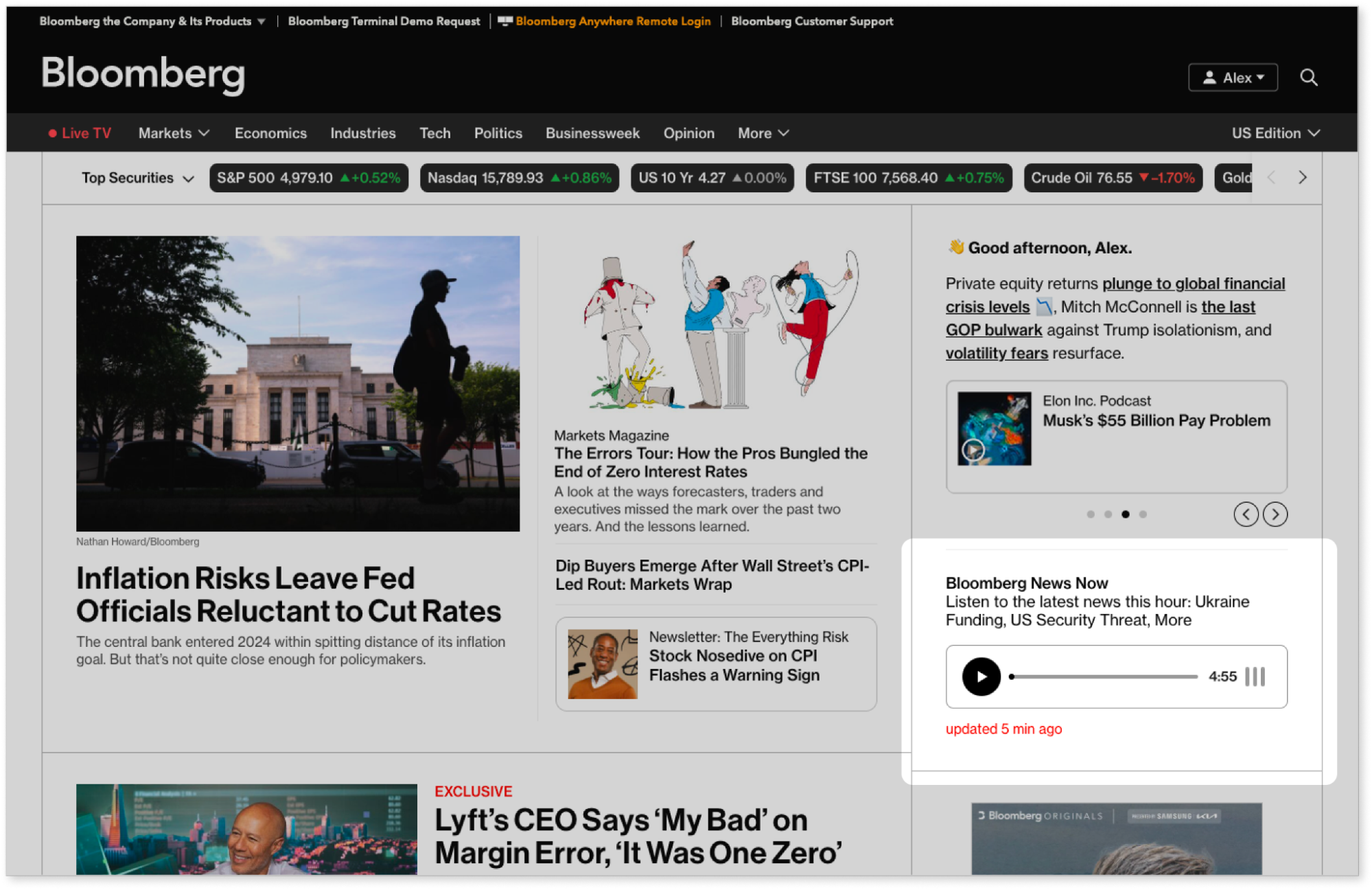
New features connecting stories to market data — for example, tickers on articles that show relevant market movements.
New filtering options, allowing users to select which categories of tickers and latest stories they see.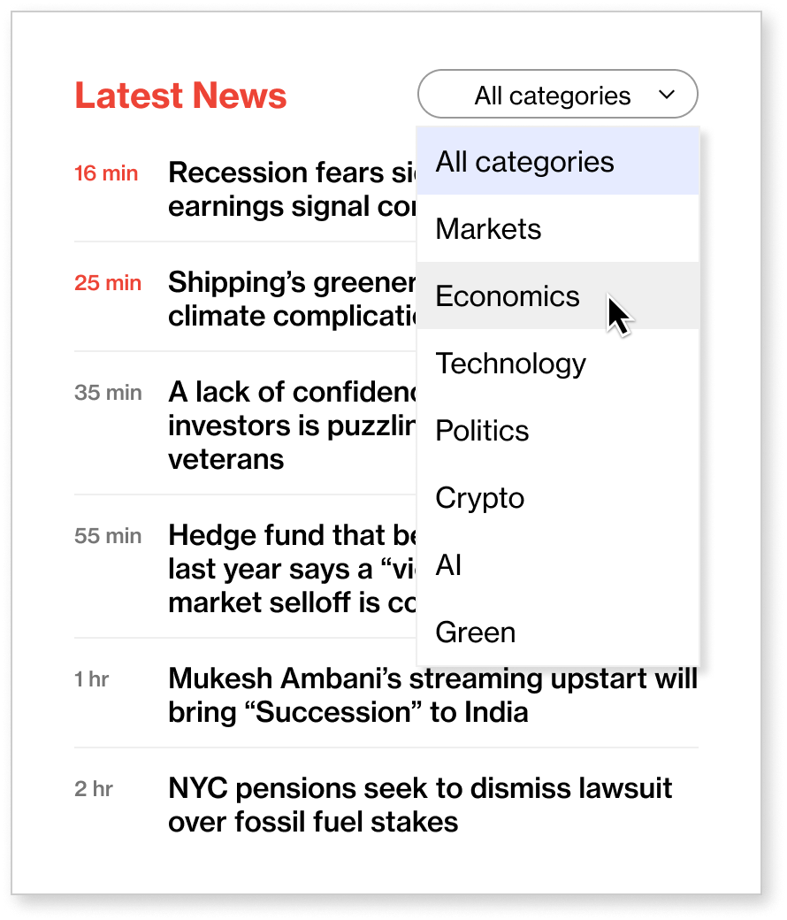
And, more discovery and personalization for users greeted by name, and stories recommended to them based on their interests and read history.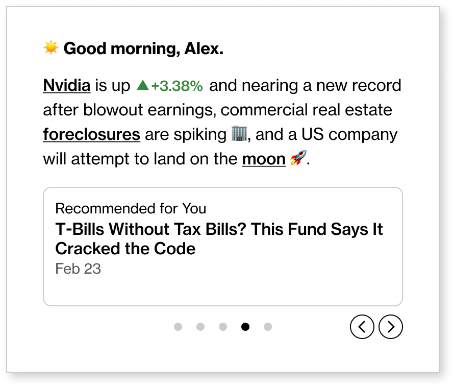
By making these changes, we know we’re better arming our users to receive the kind of context they need to draw connections across the coverage they’re consuming and the data that supports them. The joy of what we get to do is that there’s no finish line — we’ll continue to evolve our user’s experience as their habits and interests change as well. We’ll always continue to better deliver the news and context they need.
###